Eurazeo Investment Manager
-Roadmap & Strategy, hand-on work and teaching
Client /Eurazeo Investment Manager
Role /UX Design Lead
A dash of strategy, a dose of research, a sprinkle of flows and screen designs, a bit of teaching; my favourite recipe for a UX project!
THE BACKGROUND
Expanding to the mass market
Eurazeo Investment Manager, one of the largest French investment companies currently selling Private Equity products to a small pool of large public and professional investors, recently decided to open their product range to small private investors.
To support these new objectives they created:
1) A customer facing MVP site, to allow individual investors to purchase products with minimum intervention from Eurazeo’s teams (OFM).
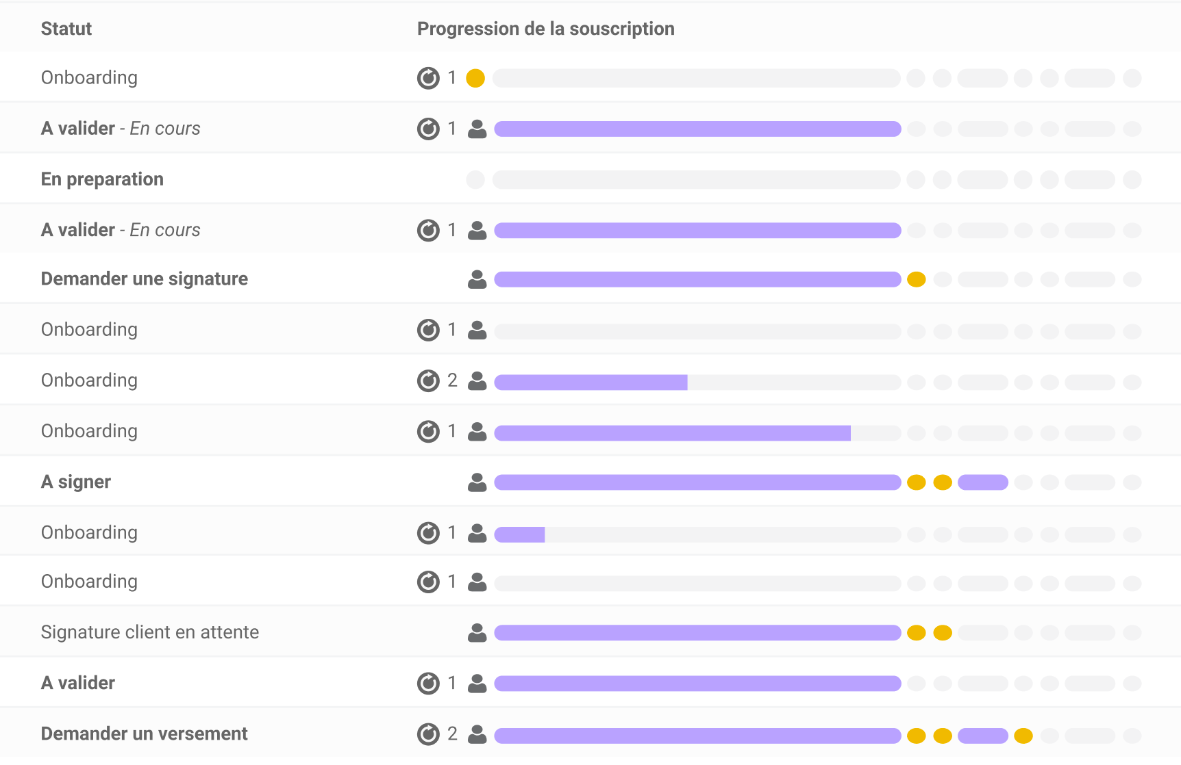
2) A back-office MVP platform, to manage the purchases ( = “subscriptions”).
Until now, everything was done on paper due to the small number of applications every year, but opening to mass market customers requires streamlined processes to avoid flooding back-office teams.
THE CHALLENGE
Hands-on UX & advising the teams
HANDS-ON WORK
Eurazeo asked me to audit the MVPs they had created, recommend changes to follow UX best practices, and design flows and screens.
TEACHING AS PART OF THE WORK
Since Eurazeo didn’t have UX capacity of their own, I came in in an advisory position; helping them understand how UX could benefit their practice and designing a timeline with specific milestones in order to understand their users better and refine their product.
Throughout the project, I worked hand-in-hand with their teams, making sure to explain in detail UX design processes, UX tools, and how to harness their value for the project and to align various stakeholders.
The objective: empowering the teams to carry on the UX work by themselves and make smart UX decisions in the future.
THE INITIAL RESEARCH
Building on existing knowledge
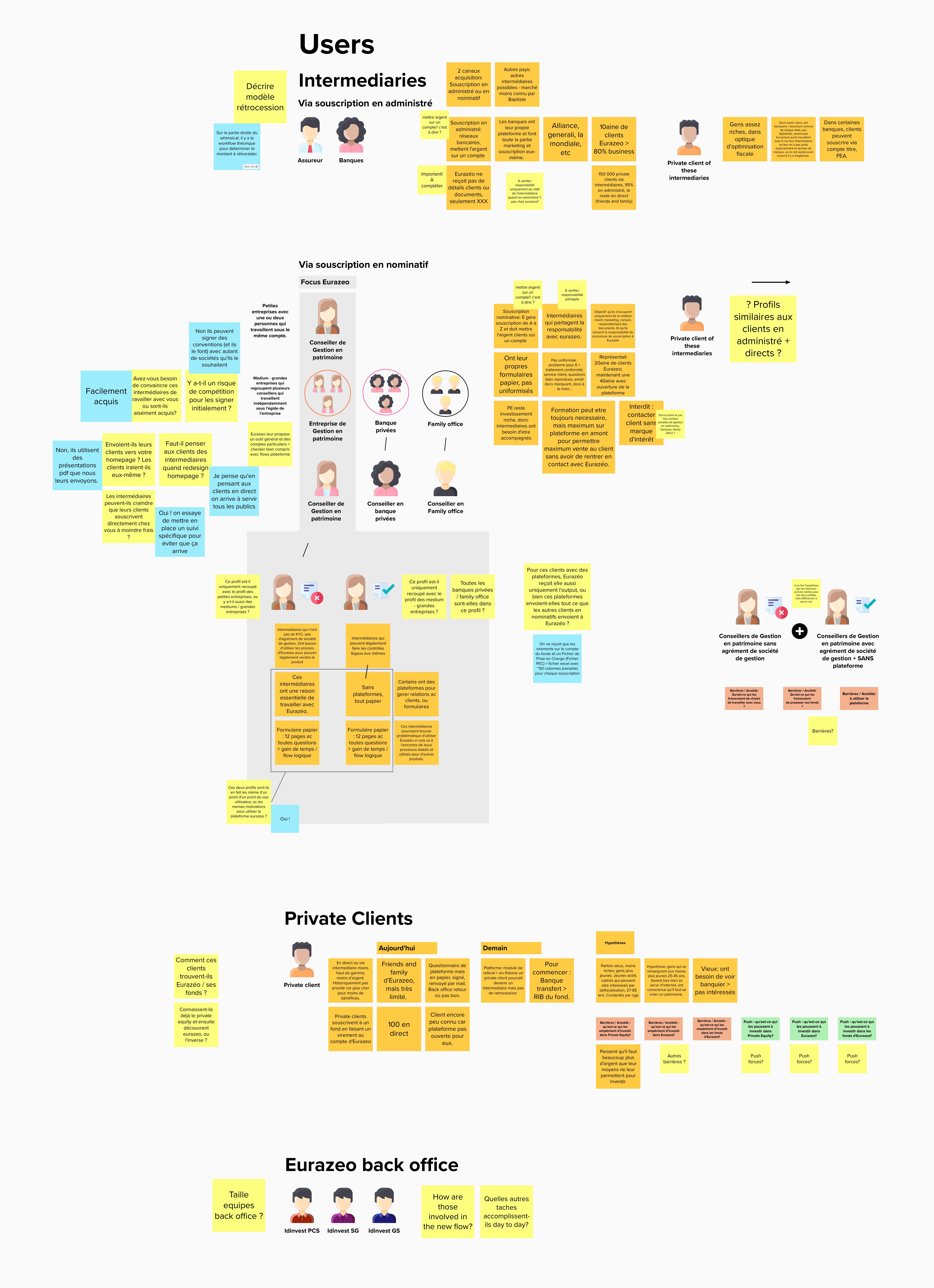
I set up workshops with Eurazeo’s stakeholders to understand the profiles of their users, the interactions between customers and back-office teams, and the journeys from awareness of Private Equity products to purchase of those products.
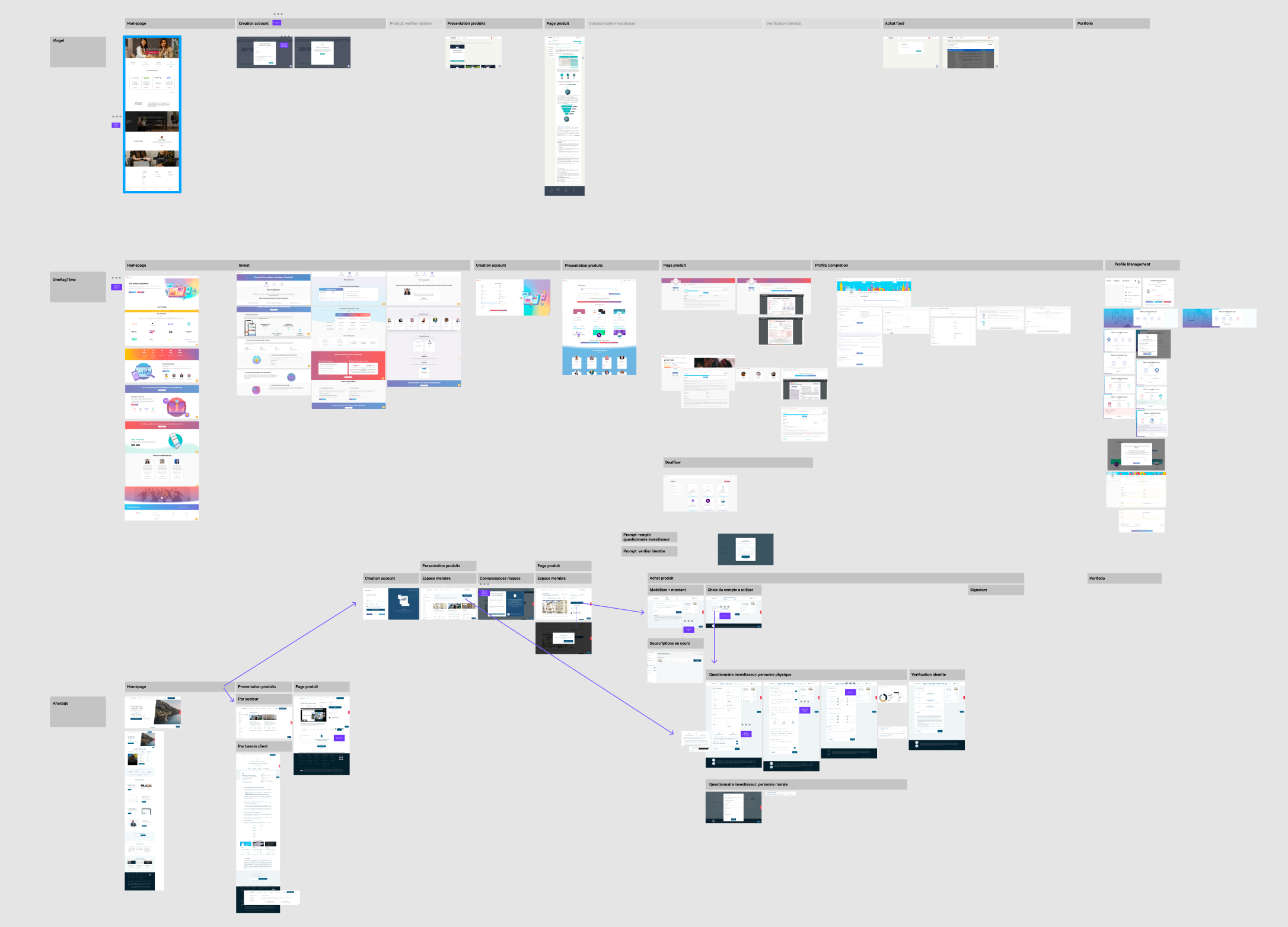
Once the initial stakeholder interviews conducted, I created User Journeys and analysed the competition.

SUBSCRIPTION FLOW DESIGN
Choosing website flows based on product and market maturity
Before buying a product, users seek to answer a set of questions to ascertain that the purchase is right for them.
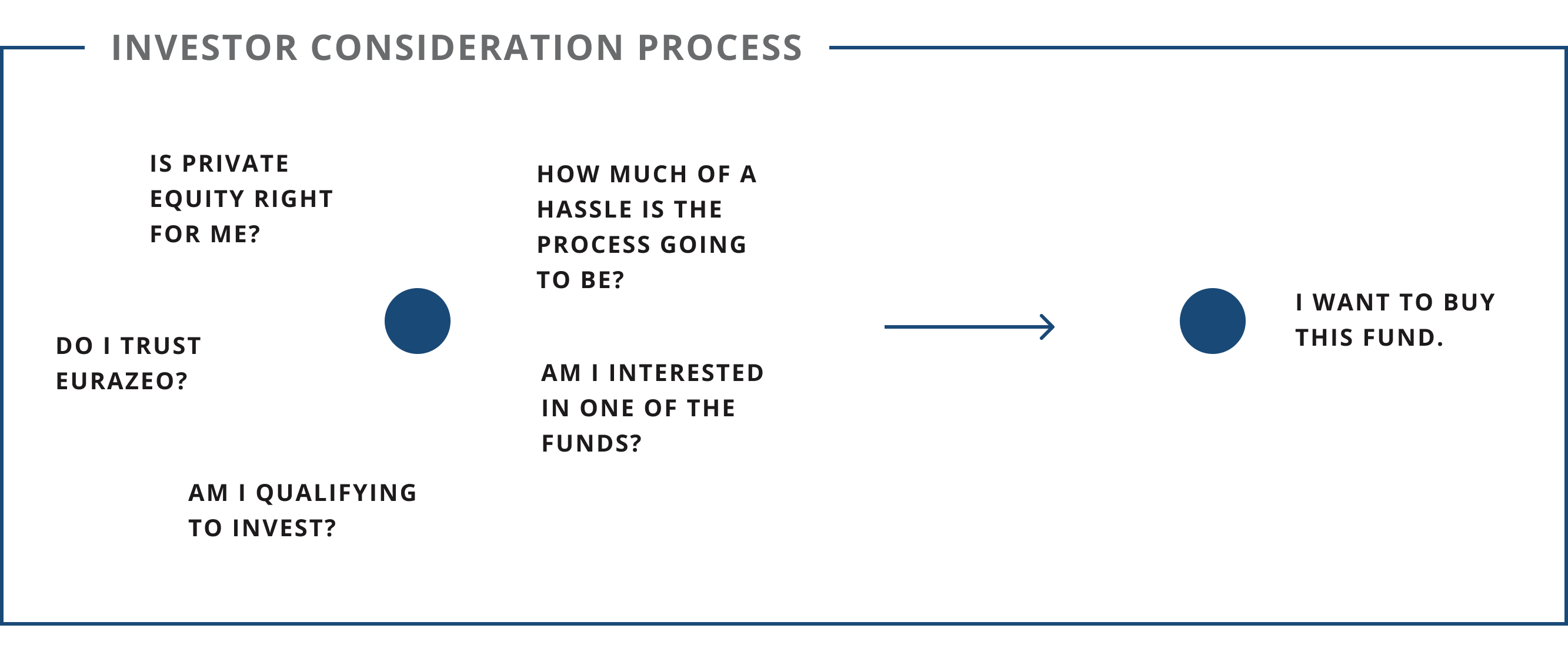
The goal of a given platform is to help its customers answer these questions as they arise, to push them to purchase the product with the least possible frictions.
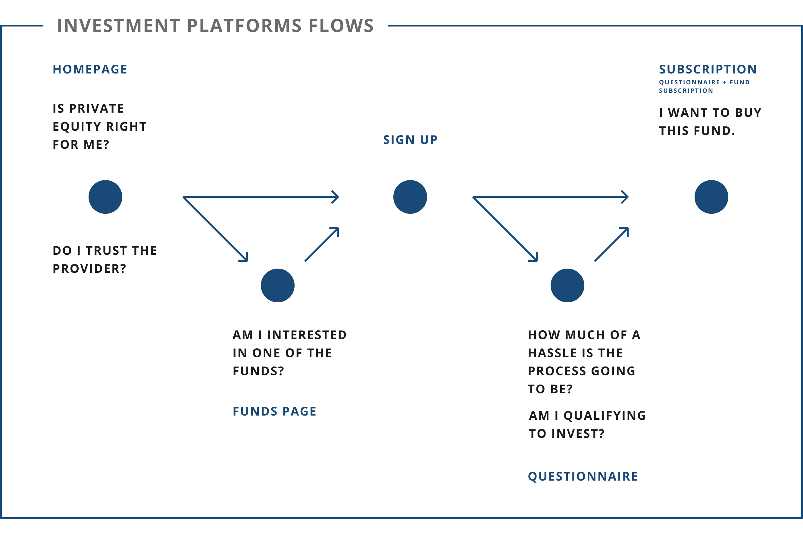
When auditing the competition, we discovered 3 types of flows, each linked to a different type of product and market maturity.
1) Direct flows for mature products on the mass market.
We find these flows are used mostly by companies who operate with funds that are well known by the public (Such as France's Assurance Vie) and therefore do not need to educate or reassure them too much about the products. In addition, they face a tough competition so the quickest and furthest they onboard users, the most likely they are to complete the sale.
2) Split flows for companies who rely on their branding.
These flows are used by companies who bank on their brand name and marketing to attract new users. They market themselves as exciting and young, and therefore focus on creating flows that feel simple, friendly and quick. They sign up new users as soon as possible, and then split the flows between legal questions and fund subscriptions to make each part more easily digestable.
3) Multiple choices flows for a broad user range and new and complex space.
These flows let users pick their own path; whether they've been convinced before by a trusted advisor or a friend and want to quickly go and buy a fund, or whether they know little about the domain and want to spend time learning about the funds and deciding whether they are right for them; they have the choice. These flows are adapted to companies with a very broad user range (from small investors to large ones) and who operate in a complex space where some users need to time to get educated and trust the company and product before signing. This is therefore the flow we recommended for Eurazeo.

INVESTOR QUESTIONNAIRE DESIGN
Simplifying the questionnaire
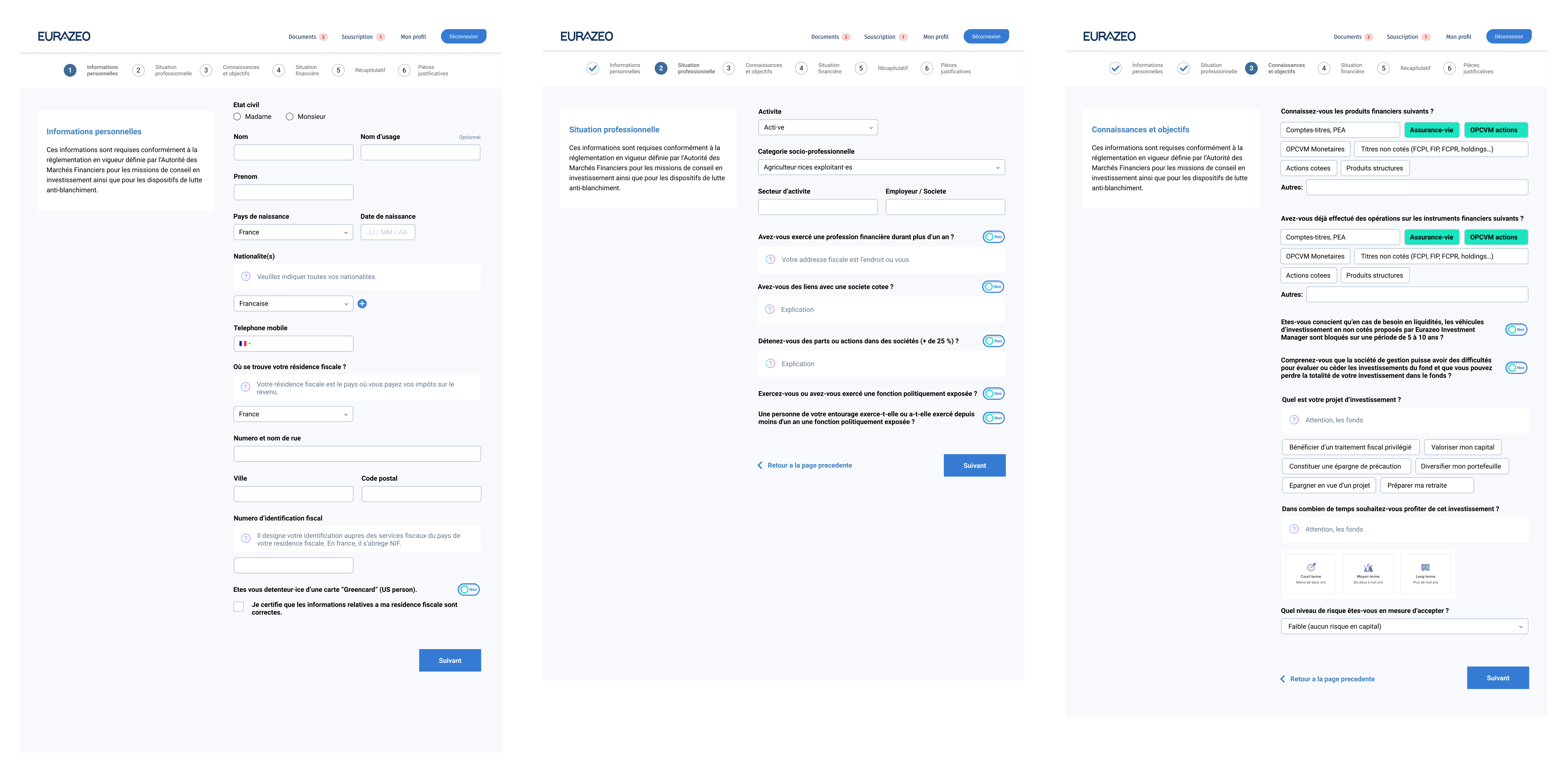
One of the main parts of the subscription flow for potential investors is the questionnaire required by law to be able to apply to funds. This is a big challenge for investment firms, as this is where a lot of their customers are at risk to drop when facing the complication of the task. I worked with Eurazeo to simplify and explain as much as possible the questions asked, and find a UI that would make the flow seem quicker and less stressful to fulfill.
Our two main criteria to design the questionnaire were:
1) To make it feel as fluid and quick to fill as possible.
2) To help users fill all info in one go, without having to go and look for help elsewhere.
BACK-OFFICE DESIGN
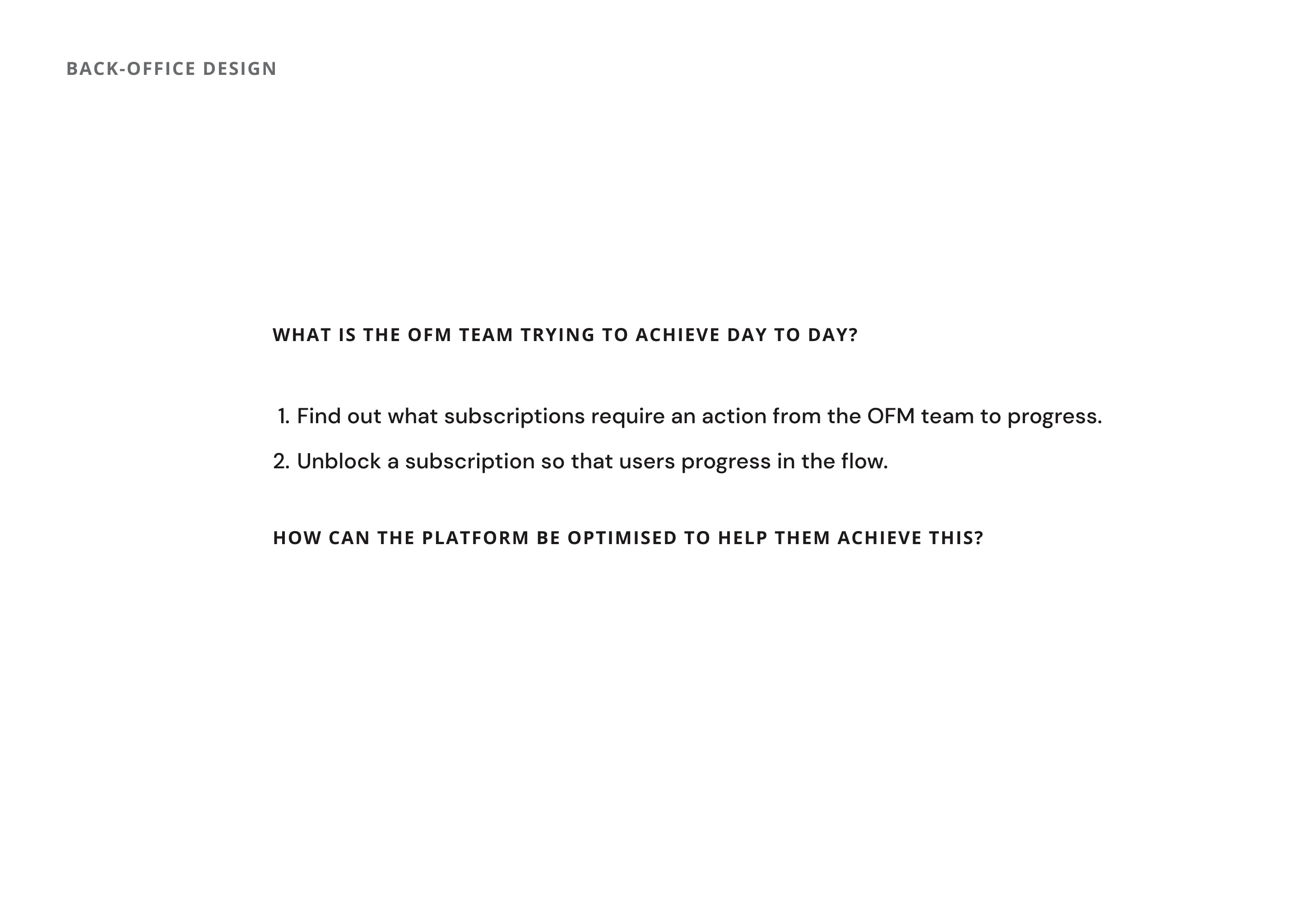
Helping teams focus on the task at hand
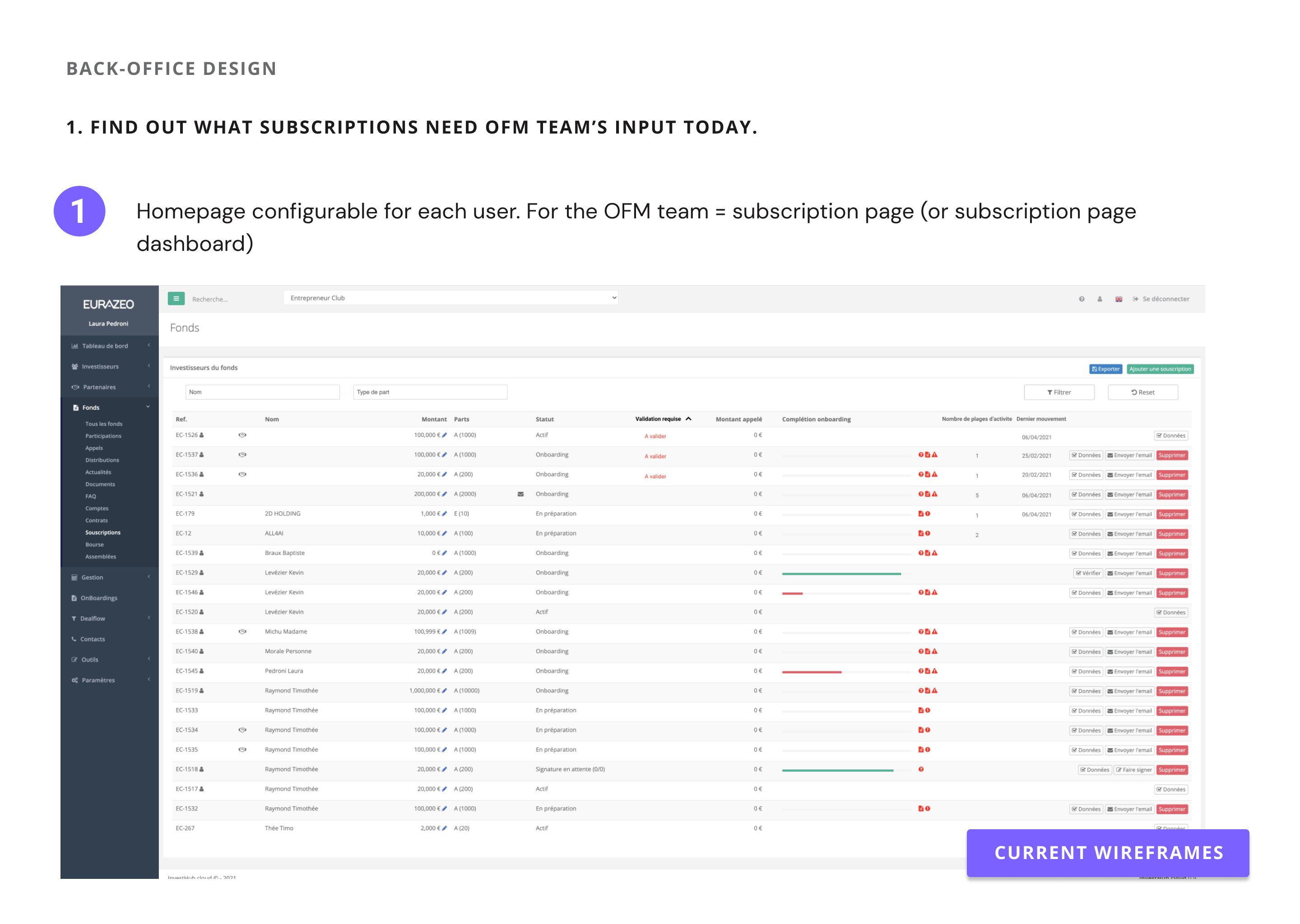
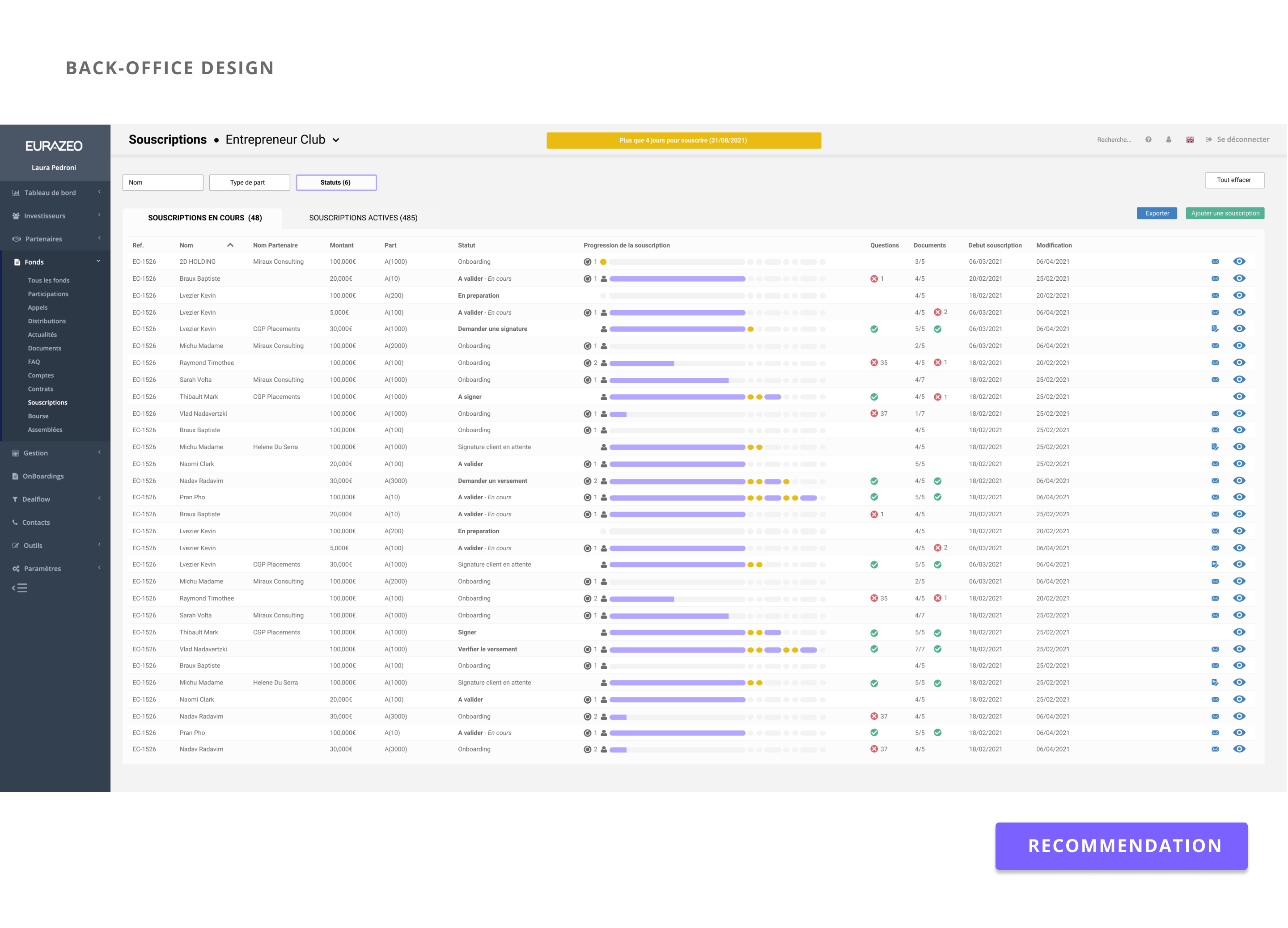
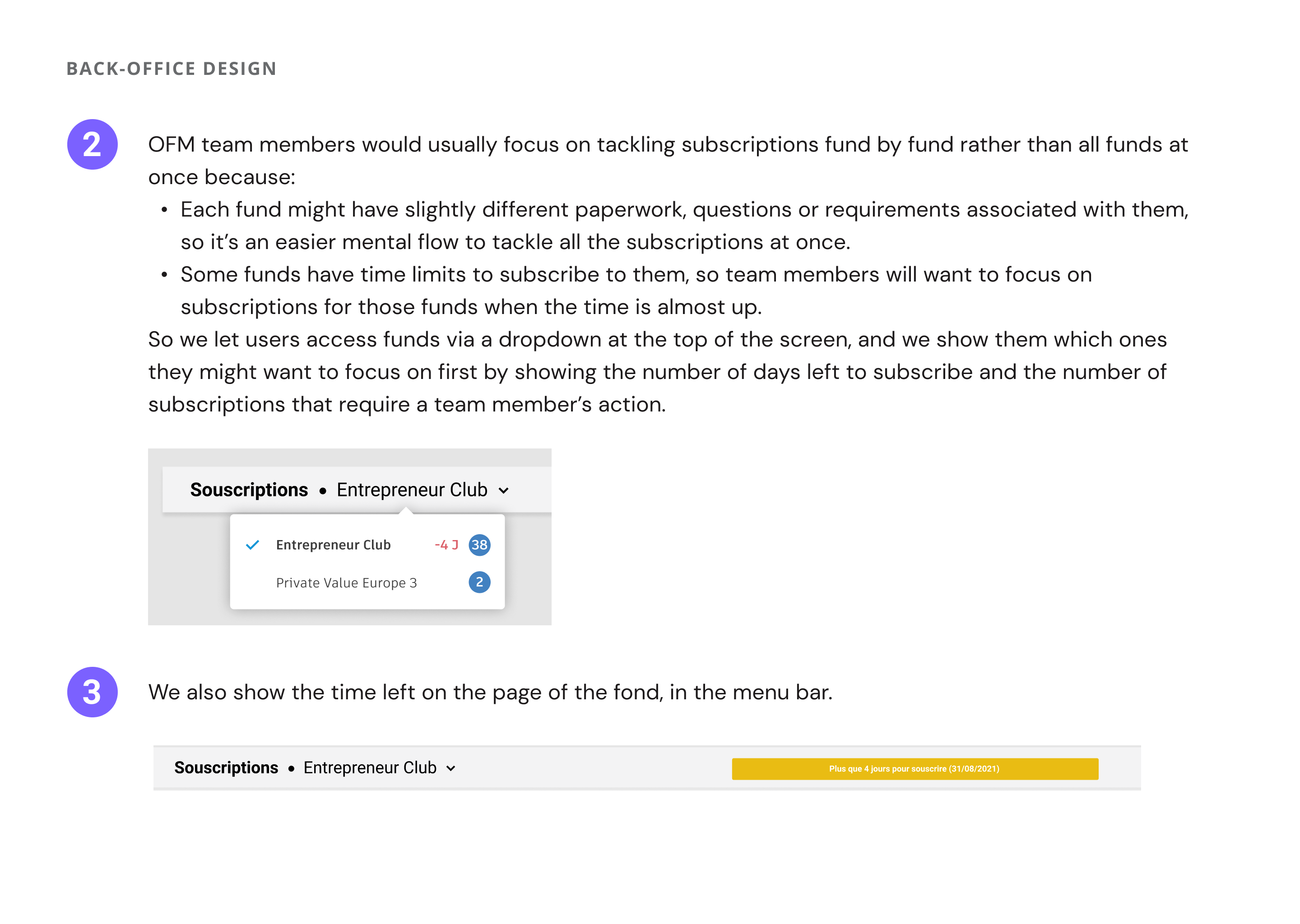
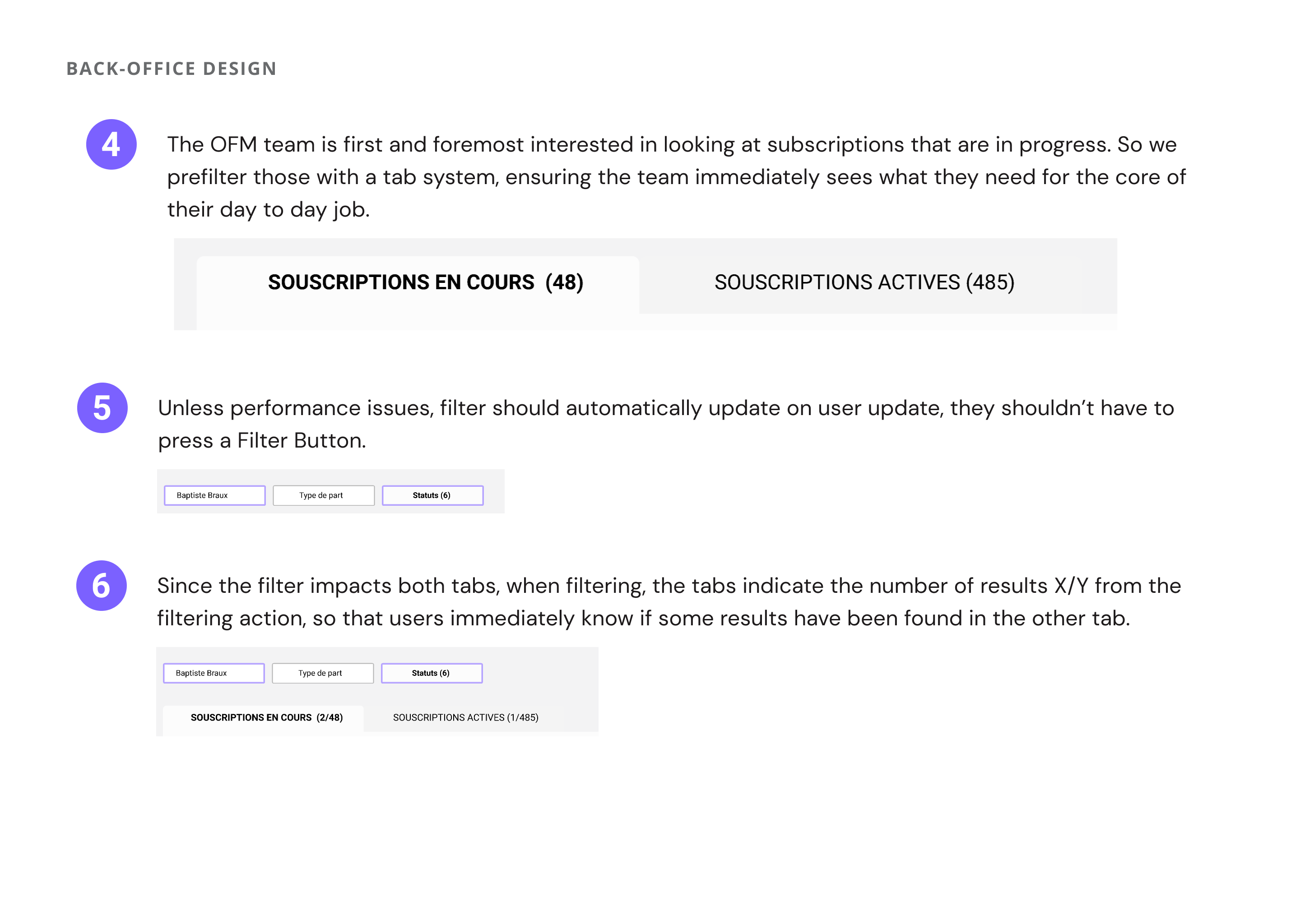
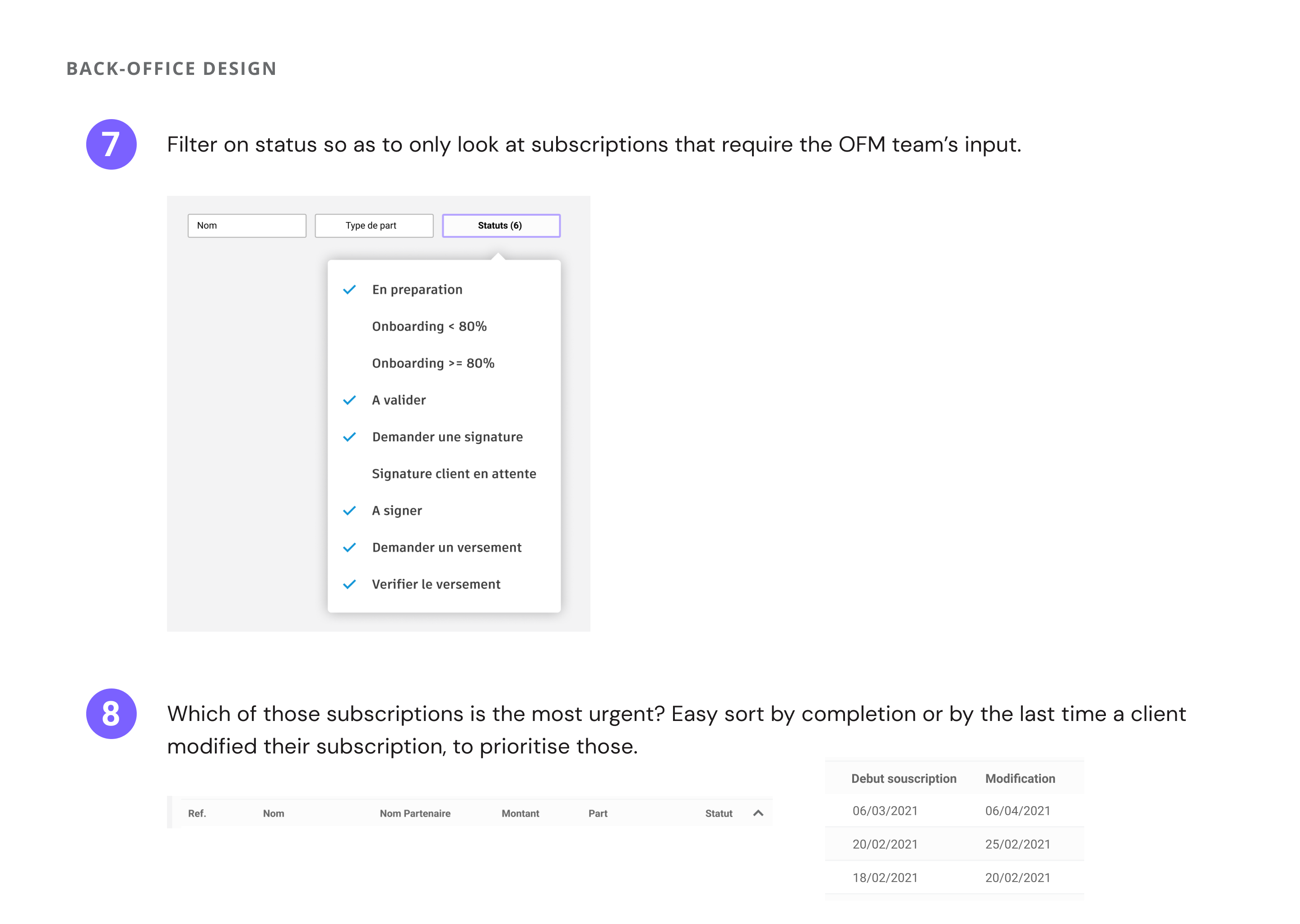
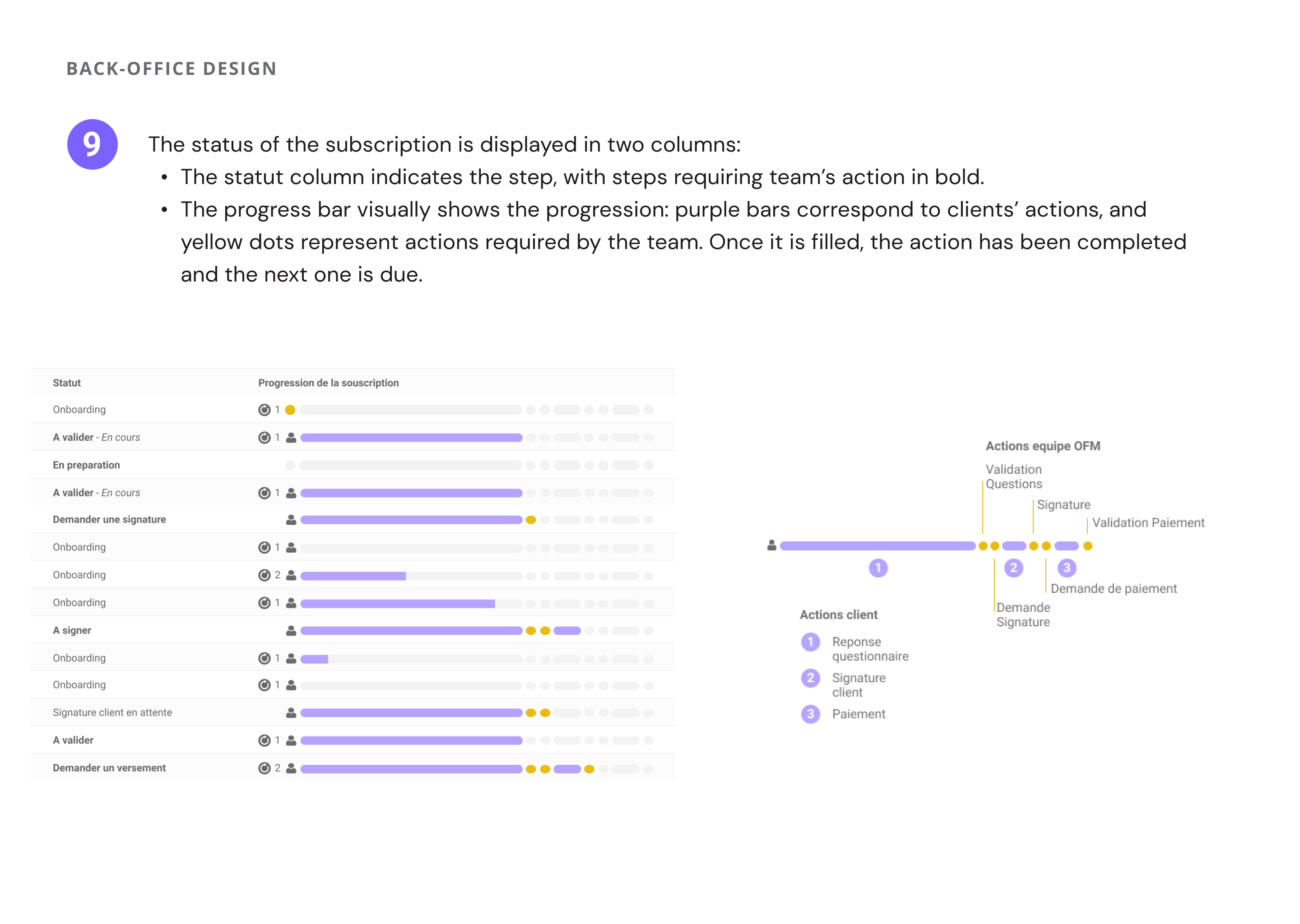
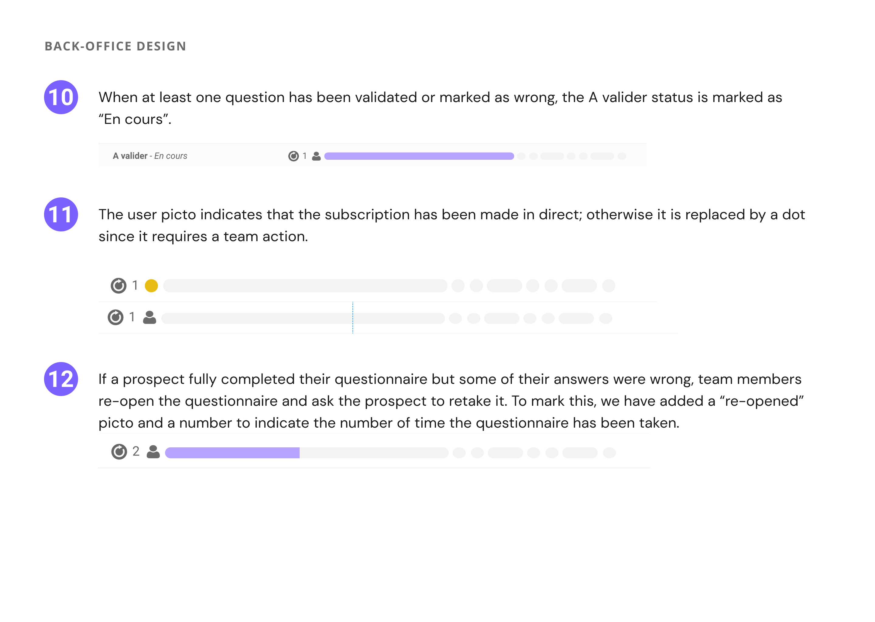
Until now, everything was done on paper due to the small number of applications every year, but opening to mass market customers requires streamlined processes to avoid flooding back-office teams. I audited Eurazeo's MVP back-office platform and made suggestions to improve it. Below the slides with suggestions shared with them.
